In this article
- 1What Packaging Design Means in Plain Words
- 2The Panels of a Box and What Each Is For
- 3Visual Hierarchy: What the Shopper Reads First
- 4Typography: Readable Before Pretty
- 5Color: Choose a Few and Print Them Predictably
- 6Imagery, Logo and White Space
- 7The Information a Pack Carries
- 8Keeping a Product Line Consistent
- 9How Material and Finish Change the Look
- 10Designing on the Dieline
- 11Proof and Sample Before You Print
- 12How to Lay Out One Box in Eight Steps
- 13Common Packaging Design Mistakes
- 14Packaging Design Checklist
- 15Your Next Step
Packaging design is the work of deciding how a box looks and what it says: the layout of each panel, the type and colors, the logo and pictures, and the information the pack carries. Good packaging design helps a shopper find your product, understand it in a moment and trust it.
This guide covers that visual layer, from what goes on each panel to how to set artwork up on a dieline. For the whole process from idea to launch, see our eight-step guide to designing packaging for a new product. For structure ideas such as windows, drawers and magnetic closures, see our ten unique box designs.
Key takeaways
- Give each panel one job. The front sells, the back informs and the sides support.
- Set a reading order. Brand mark, then product name, then details. If everything is loud, nothing gets read.
- Limit type and color. Two typefaces and a small palette look cleaner and print more reliably.
- Remember the material. The same color looks different on white board and on kraft, and a finish changes it again.
- Design on the dieline. Keep text inside the safe area, run backgrounds into the bleed and keep key content off folds.
- Check a proof or sample. A 3D preview and a sample in your hand catch what a screen hides.
What Packaging Design Means in Plain Words
Packaging design combines structure (the shape, size and material of the box), graphics (layout, type, color, logo and pictures) and information (what the pack tells the buyer). Our guide to choosing the right box for your product covers structure. This article covers the other two.
A pack has two jobs: it protects the product on the way to the customer, and it sells the product on a shelf, in a photo or in a hand. A beautiful design on a box that crushes in the mail fails the first job. A strong box with a muddy front panel fails the second. For how good design helps people once the box is open, read our guide on how customers benefit from packaging design.
The Panels of a Box and What Each Is For
A folded box has six faces: front, back, two sides, top and bottom, plus the inside. Each is seen at a different moment, so each deserves its own job. The drawing shows a straight tuck end box laid flat, numbered in the order a shopper usually looks.
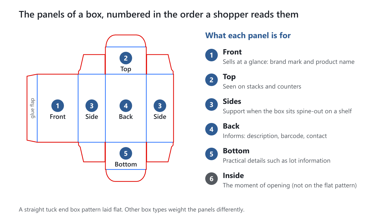
| Panel | What it is for | Put here | Avoid |
|---|---|---|---|
| Front | Selling at a glance | Brand mark, product name, one short line | More than one main message |
| Top | Seen on stacks and counters | Logo or product name, upright | Text that reads upside down |
| Sides | Support when shelved spine-out | Name, brand mark, variant such as scent or size | Repeating the front |
| Back | Informing and reassuring | Description, how to use it, barcode if sold in stores | A wall of tiny text |
| Bottom | Practical details | Lot or batch information | Anything shoppers must see |
| Inside | The moment of opening | A message, pattern or instructions | Must-read information shoppers only see after buying |
Think about how the box will be stored and shown before you give any panel the biggest brand mark. A box on a shelf spine-out is read from its side. A box in an online photo is read from its front and top.
Inside print is an option on some box types, such as mailer boxes, so ask us about yours. Compare how the panels work on tuck boxes, where the front carries the sale, and on rigid boxes, where the lid does much of the work.
Visual Hierarchy: What the Shopper Reads First
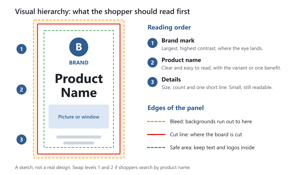
Visual hierarchy is the order in which the eye reads a panel. Shoppers give a box only a moment, so decide the order before you choose colors or pictures. Three levels are enough on a front panel.
- Level 1: the brand mark. Largest and highest in contrast, where the eye lands.
- Level 2: the product name. Clear and easy to read, with the variant or one benefit.
- Level 3: the details. Size, count and one short line, small but still readable.
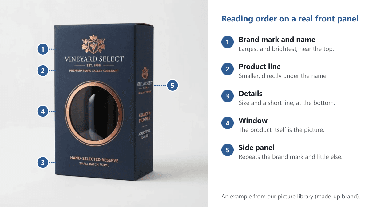
Here is the order on a real example from our picture library. The brand mark and name lead, the product line follows, the window shows the product and the details sit at the bottom.
The sketch below shows the same three levels as a flat layout, with the edges of the panel marked.
If shoppers search by product name more than by brand, swap levels 1 and 2. You build the order with size, contrast, position and space: the important item is largest, darkest, near the top or center, and has room around it.
Then run the squint test. Step back, or squint until the details blur. You should still see the brand mark first, then the name. If you see a gray mass, or your eye jumps between five things, remove something.
Typography: Readable Before Pretty
Typography is the choice and setting of type. Use two typefaces at most: one for names and headings, one for details. Plain, legible faces carry most of the weight, and a decorative script suits a short name but not a paragraph.
- Contrast between the faces. Pair a bold heading face with a simple text face. Two faces that look almost alike seem like a mistake.
- Size. As a general guide, many designers keep box text at about 7 point or larger, because tiny type is easy to lose when ink spreads. Rules for required statements, such as warnings, may set their own sizes, so check the rules for your product.
- Weight on dark backgrounds. Light text on a dark color needs a medium or bold weight, since thin strokes can fill in.
- Away from curves and folds. Keep words off creases, tuck slits, curved corners and glue flaps.
- Fonts in the file. Outline or embed them. Our prepress guide explains how.
Color: Choose a Few and Print Them Predictably
Pick a small palette: a main brand color, an accent and a neutral such as white, black or kraft. For what colors say about a brand, see our guide to choosing colors for custom packaging.
CMYK and Pantone. CMYK builds color from four inks (cyan, magenta, yellow and black) and suits photos. Pantone is a specific ink for one exact color, which suits a brand color that must match every time. We print in CMYK or Pantone, and our color systems article explains when to use each.
Screen versus print. A screen makes color with light, while a box reflects light off ink on board. Bright screen colors, such as vivid blues and greens, often look duller in print. Judge color on a printed proof or sample, not on a monitor.
White versus kraft. White board is the brightest base and shows color closest to your file. Brown kraft is warm and natural, so colors look darker and light colors lose contrast. The drawing prints the same four colors on both, with the kraft side simulated.
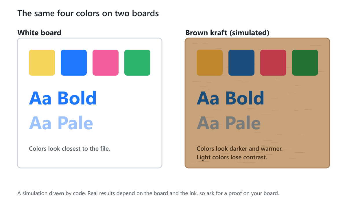
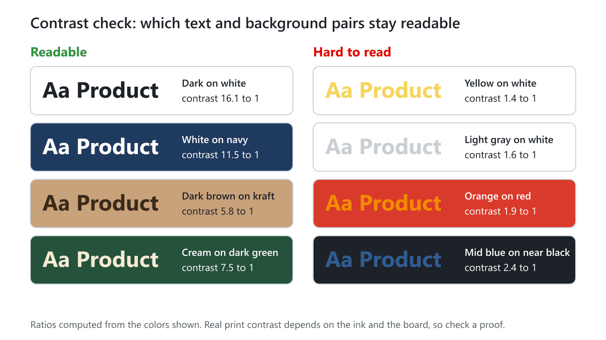
A contrast check. Turn the artwork to black and white. If the name and details still stand out from their backgrounds, the contrast is enough. If two colors merge into one gray, change one. The chart shows pairs that pass and pairs that fail, with the contrast ratio worked out from the colors.
Imagery, Logo and White Space
Logo. Use a vector version (SVG, PDF or AI) so it stays sharp at any size, with clear space around it. A common rule is room about the height of one letter of the logo. Put it in the same spot on every panel where it appears.
Pictures. A common rule of thumb is about 300 dots per inch (dpi) at the printed size. For example, a picture that prints 3 inches wide needs about 900 pixels across. A web image stretched across a panel prints soft.
White space. The empty area around elements, also called negative space, is not wasted. It gives the main message room and makes a pack look calm. An empty kraft or solid-color area counts too. If a panel feels crowded, remove an element before you shrink everything.
The Information a Pack Carries
Decide early what must go on the pack, because some items have a fixed size or position.
- Brand and product name. Always.
- Size, count or quantity. For example "4 oz" or "Pack of 6".
- A short description. One line on what it is and why it is good.
- A barcode, where the product is sold in stores. Dark on a plain light background with a blank margin, flat and off folds. Test a printed proof.
- Contact details. A web address or email.
Some products also need an ingredient list, warnings, a lot number, an origin statement, a certification mark or a recycling symbol. What is required depends on your product and where you sell it. This is general information, not legal advice, so check the rules for your product and country, and print only claims you can support.
Keeping a Product Line Consistent
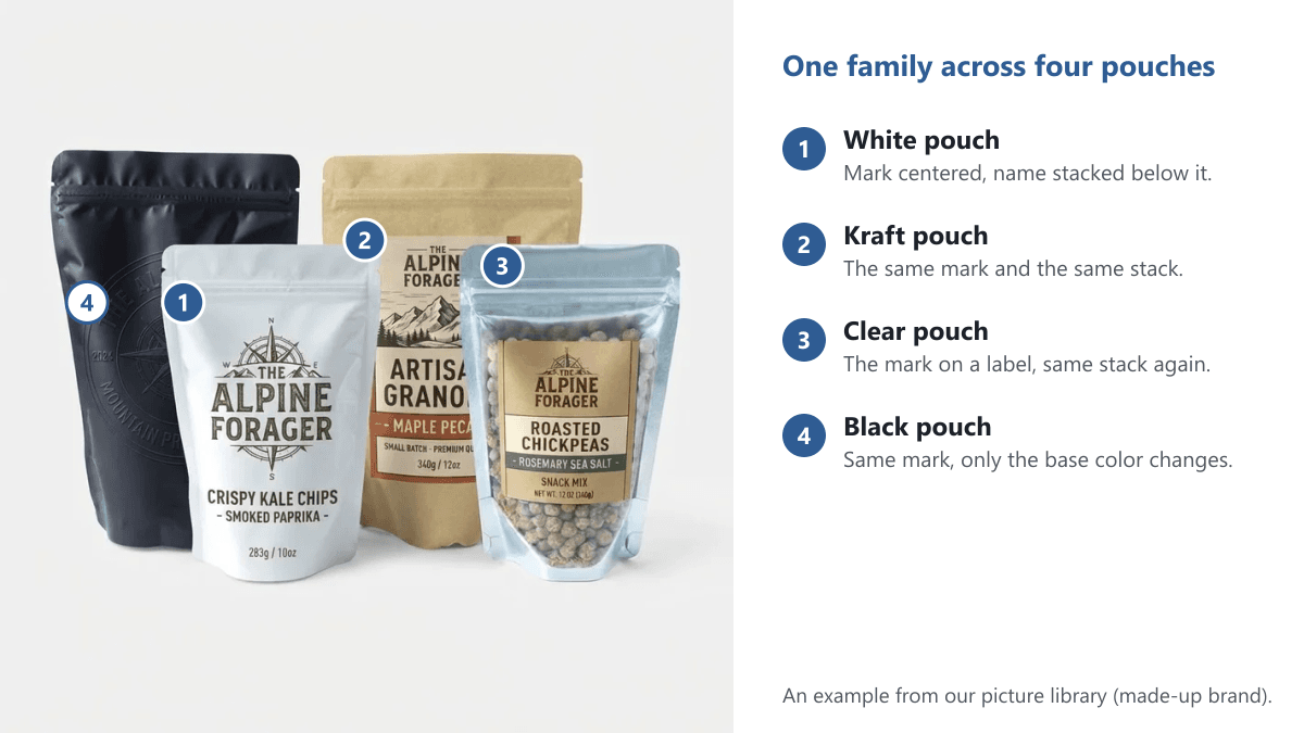
Several products should look like one family on a shelf and in a photo. Make a few decisions once: a shared grid for the brand mark, name and details, one accent color per variant, the same logo spot and size, and the same type.
For example, an invented soap brand with three scents puts its logo top center, the scent name in the middle and a color band at the bottom. Only the name and the band color change. Our guide to branded boxes goes deeper on keeping a look together across a range.
This example from our picture library shows the idea on four pouches. The mark and the stacked name stay the same, and only the base changes from white to kraft, clear and black.
How Material and Finish Change the Look
The surface is part of the design, so choose board and coating together with the artwork, not after it.
| Option | What it does to the look | Good to know |
|---|---|---|
| White board | Bright base, colors close to the file | Best for fine detail |
| Brown kraft board | Warm base, darker colors | Keep artwork bold |
| Matte coating | Flat, low glare, soft look | Easy to read in any light |
| Glossy coating | Shiny, deeper-looking color | Glare can hide small text |
| Satin coating | A soft sheen between matte and gloss | A balanced look |
| Soft touch coating | Velvety feel, muted sheen | The feel matters as much as the look |
| Foil stamping | Metallic shine on chosen areas | Best on logos and simple shapes |
| Embossing or debossing | Raised or pressed shapes | Needs bold shapes with room around them |
| Spot UV | Shiny coating on chosen areas | Best on bold shapes, often over matte |
In this example from our picture library, a metallic wordmark and a faint raised pattern sit on a dark box. They show how foil stamping and embossing look when each is used on one simple element.
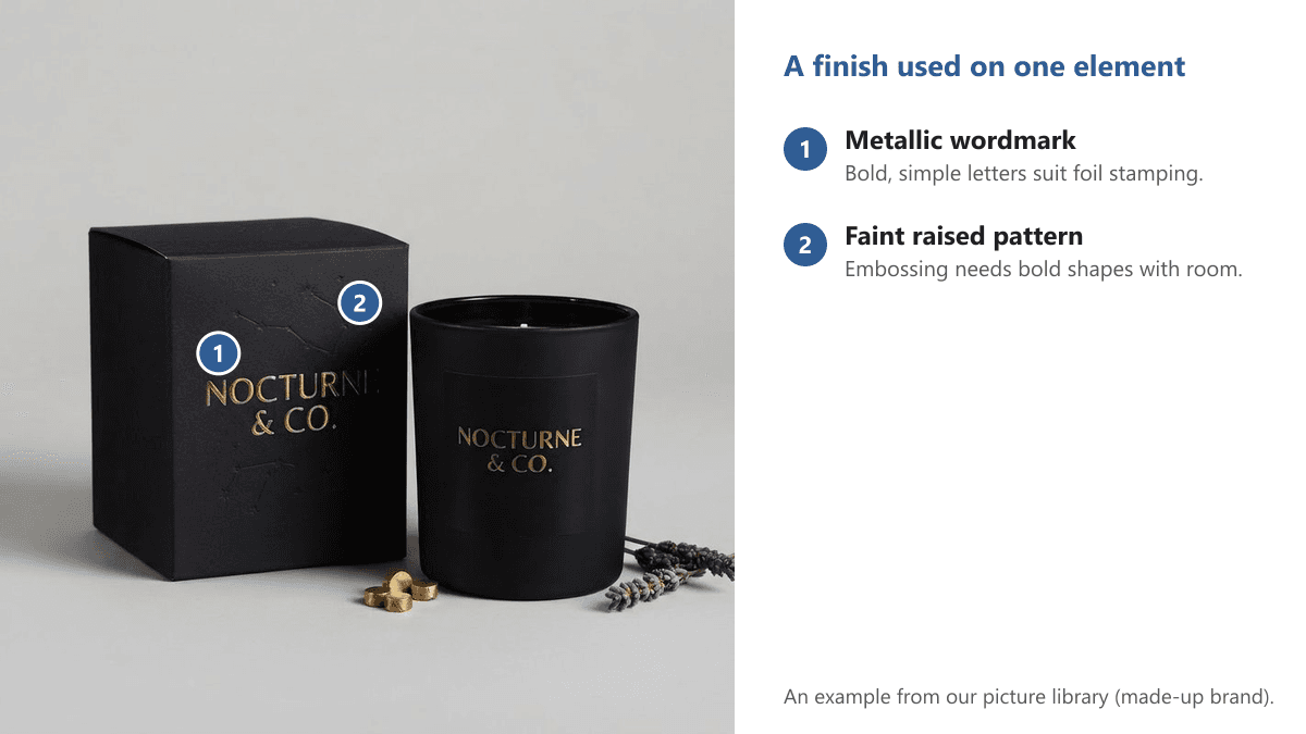
Foil, embossing and spot UV add the most when they highlight one element, such as the logo. On every element they compete with your hierarchy, and fine lines can fill in or look rough. Our article on varnish and lamination explains the coatings. A window patch lets the product show through, so leave room for it. Finish options depend on the product, so ask us about your box.
Designing on the Dieline
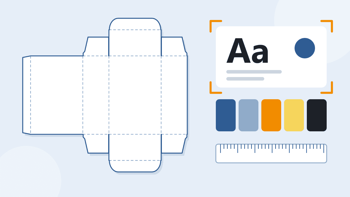
A dieline is the flat pattern of a box, with cut lines, creases and glue areas. Your artwork sits on top of it. Our free dieline templates come as PDF, SVG and DXF files at real size, with no sign-up. They do not compensate for board thickness, and we confirm the final dieline with you before printing.
- Safe area. Keep text and logos inside a margin set in from the cut line, so a small shift in cutting does not trim them.
- Bleed. Let backgrounds and pictures run past the cut line. Our dieline tool can add a 3 mm or 5 mm bleed line. Read what bleed is in packaging.
- Folds and flaps. Keep words off creases. A glue flap is hidden once the box is made, and tuck and dust flaps are partly hidden, so keep key content off them.
- Windows and panel direction. Keep artwork clear of windows, and check that text on every panel is upright on the folded box.
For the file itself, follow our guide to preparing dielines for prepress printing. To size the box to your product, see how to measure a box correctly.
Proof and Sample Before You Print
We offer free design support and show a 3D preview with your artwork, so you can check where each panel lands before printing. Look at panel direction, distance from folds, the barcode and the logo position. Our artwork and proofs article explains how we check the file with you.
For a closer look, order a sample. The Standard Sample Kit costs $50, shipping included, and the fee is not credited toward an order. It may not include rigid boxes or boxes that ship assembled. The samples page lists single samples, such as structural, simplified, pre-production, digital print proof and press proof, and what each one shows.
How to Lay Out One Box in Eight Steps
- 1. List what must go on the pack. Name, size or count, description, barcode and any required text.
- 2. Get the dieline. Download the free template for your box type and size.
- 3. Pick the board and finish. White or kraft, and the coating, since both change color.
- 4. Set the reading order. Levels 1, 2 and 3 on the front, and one job for each other panel.
- 5. Place the fixed items. Barcode, required text, windows and logo clear space come first.
- 6. Choose type and palette. Two typefaces and two or three colors, checked for contrast.
- 7. Add pictures and white space. Sharp images at about 300 dpi, and nothing that does not earn its place.
- 8. Check, then proof. Do the squint test, print the template at 100% and fold it, then review the 3D preview and a sample.
Common Packaging Design Mistakes
- Putting too many messages on the front panel.
- Choosing colors on a screen and never seeing them on the real board.
- Using three or four typefaces, or thin type on a dark background.
- Running text or the barcode across a fold, a glue flap or a window.
- Using low-resolution pictures, or forgetting bleed.
- Putting foil or embossing on fine lines and small text.
- Leaving required text until the end, when no space is left.
Packaging Design Checklist
- A reading order, and one job for every panel.
- Two typefaces at most, readable at their printed size.
- A small palette, checked in black and white, tested on your board.
- Pictures at about 300 dpi and a vector logo.
- Text inside the safe area, backgrounds in the bleed, nothing key on a fold.
- Barcode and any required text placed and checked.
- A 3D preview reviewed and a sample checked before the full order.
Your Next Step
If you have a product and a logo, start with the dieline: download the free template, place your panels using the steps above and send us the file. If you would rather not start from a blank page, tell us what you are making. Design support is free.
Get a free quote and we reply within 1 business day. Minimum orders depend on the product, and each product page states its own. You can also browse our custom packaging.
Frequently Asked Questions
What is packaging design?
Packaging design is the planning of a pack's structure, graphics and information so it protects the product and helps sell it. The graphics part covers layout, type, color, logo and pictures. The information part covers what the pack must tell the buyer.
What are the main elements of packaging design?
They are the structure (shape, size and material), the layout of each panel, typography, color, imagery and logo, and the information on the pack. Finishes such as matte, gloss or foil stamping then change how those graphics look and feel.
How many fonts should I use on a box?
Use two at most: one for names and headings, one for details. A third rarely helps and can look cluttered. Keep type readable at its printed size, and give light text on a dark background a medium or bold weight.
What resolution should pictures be for packaging?
A common rule of thumb is about 300 dpi at the size the picture will print. Use a vector file for your logo. A low-resolution picture stretched across a panel prints soft, so check the pixel size against the printed size.
Will my colors look the same on kraft board?
No. Kraft board is brown, so printed colors look warmer and darker, and light colors lose contrast. Pick bold colors for kraft, and ask for a proof or sample on the board you will use.
Can you help me design my packaging?
Yes. Design support is free. Use our free dieline templates to lay out your artwork, then we confirm the dieline and show a 3D preview with your artwork before printing. Get a free quote and we reply within 1 business day.
Written by the PacksDo Team
We make custom printed packaging, from boxes and mailers to bags, labels and inserts. Questions about this guide? Ask us.